POLI.design
UI design & testing
Here's a project I developed together with Carlotta and Selene during my executive course at POLI.design. The goal was to create a UI based on a given UX.
The project focused on redesigning a section of the POLI.design website. The persona was a newly enrolled student who needed a clear and intuitive interface to manage their university life.
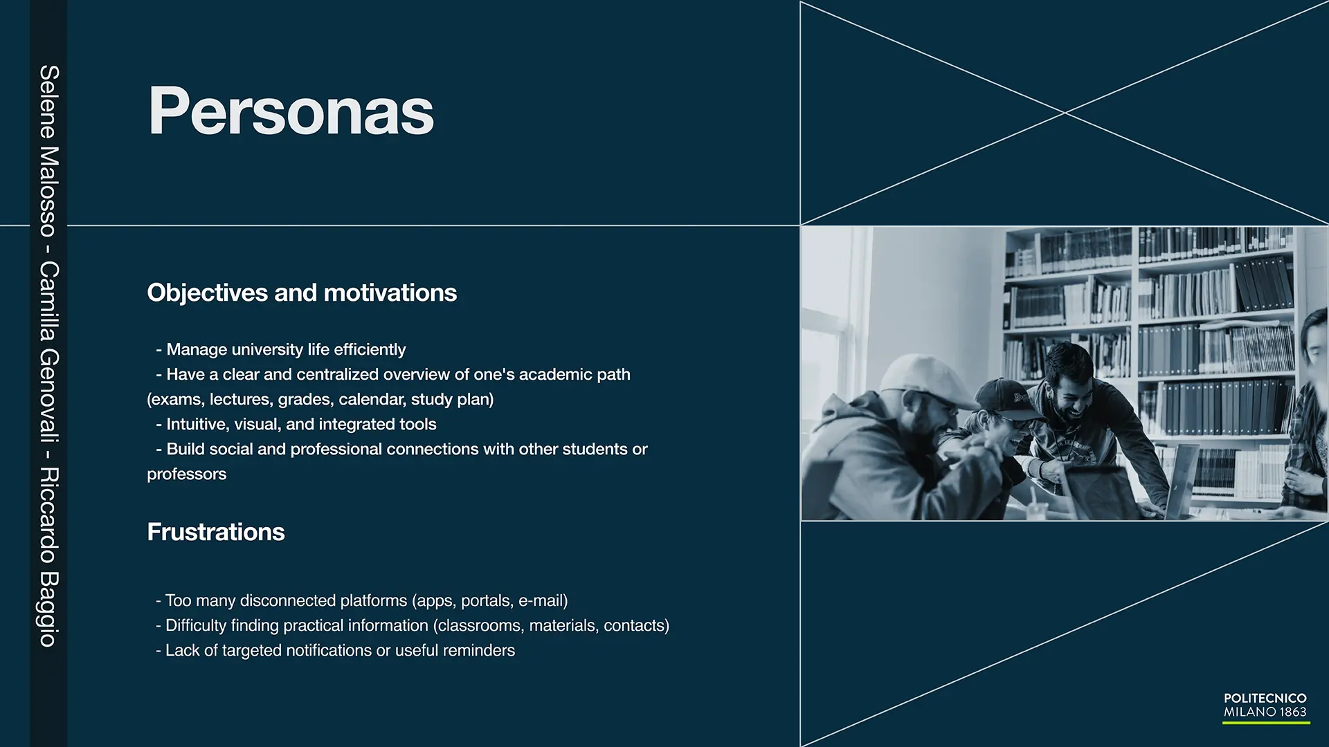
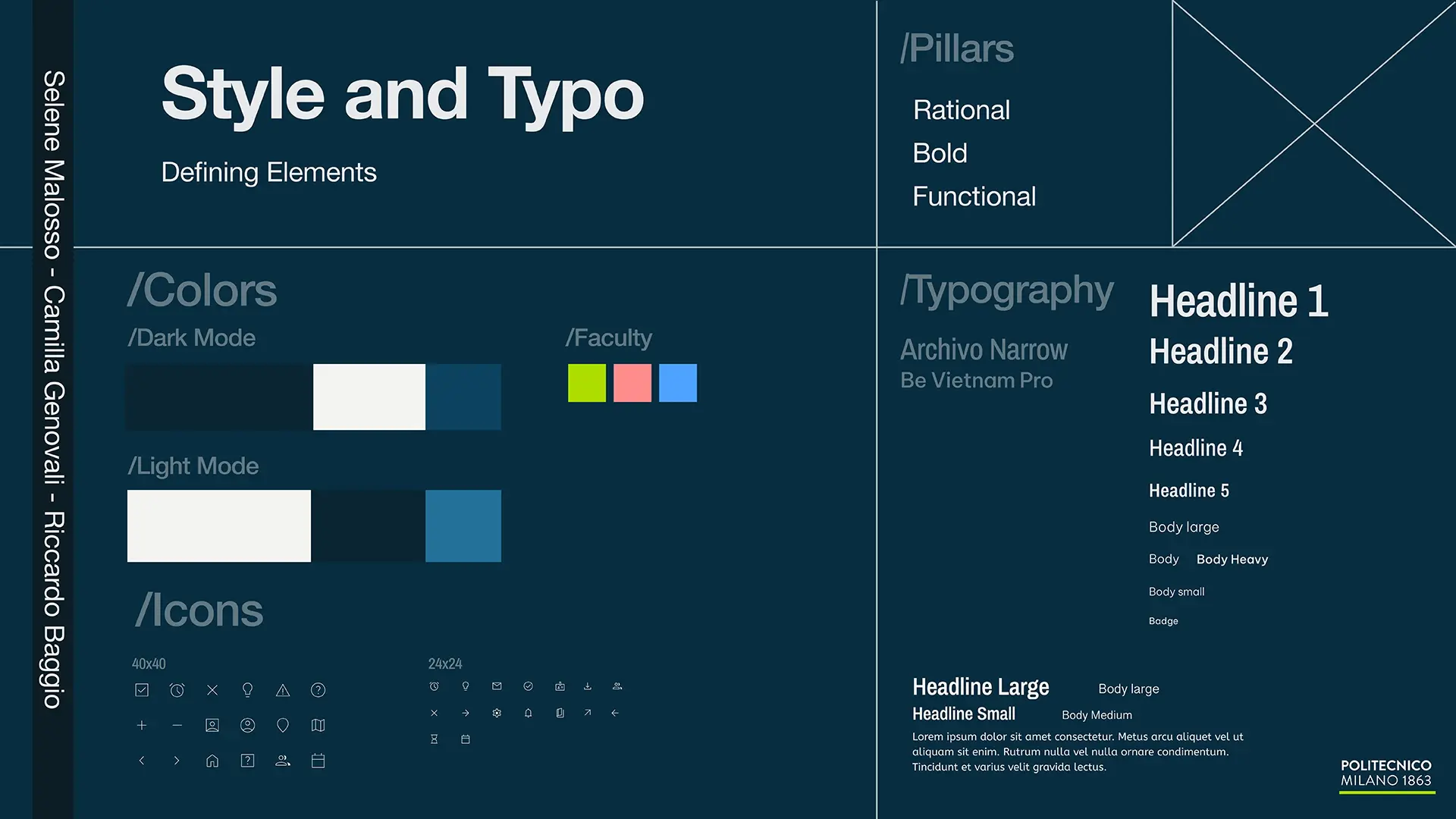
We decided to name this interface Crossways and designed the layout around straight lines, reminiscent of technical drawings. The concept of intersections reflects the nature of the Politecnico and its architecture, so we wanted the app to express this identity.
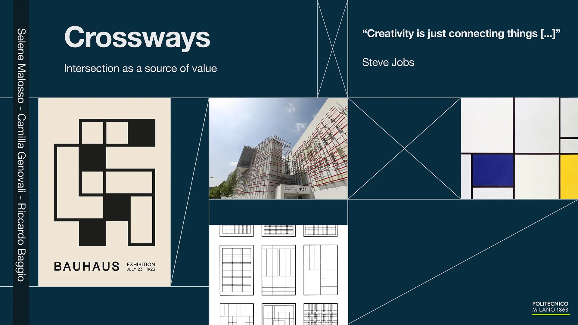
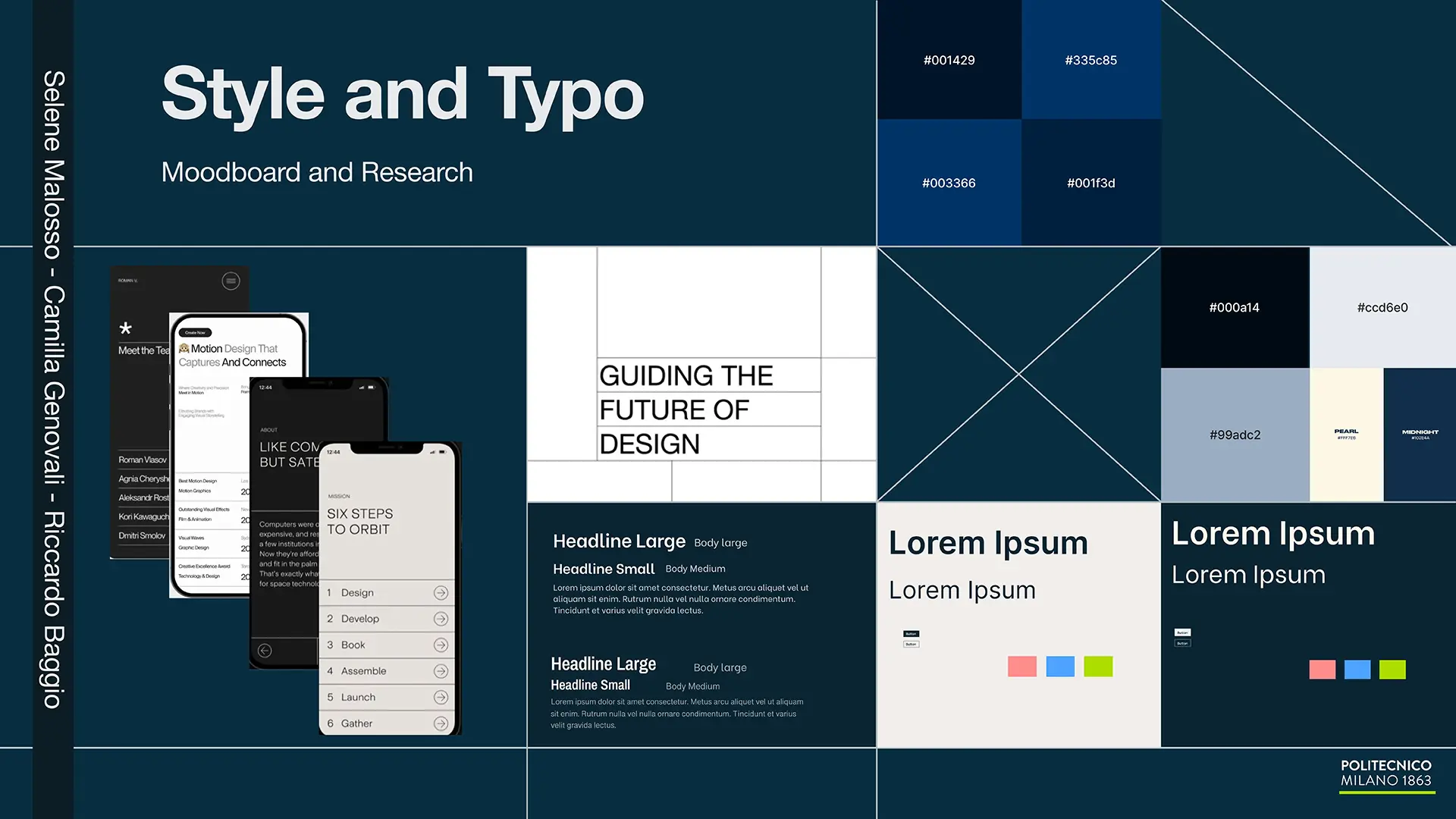
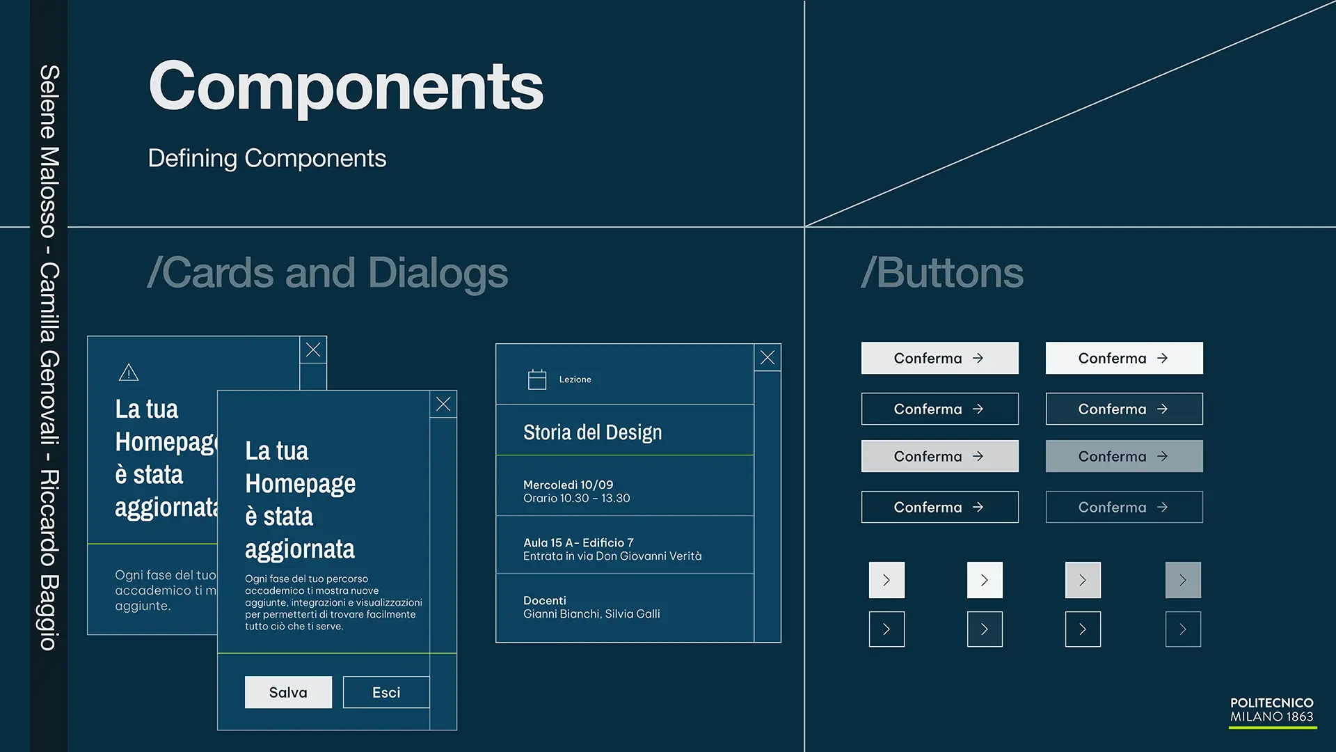
Our goal was to create something sleek, functional, and visually striking. Bauhaus was one of our main references for typography. We chose sharp corners and clean lines to convey the technical character of the different university faculties, each identified through specific colors.
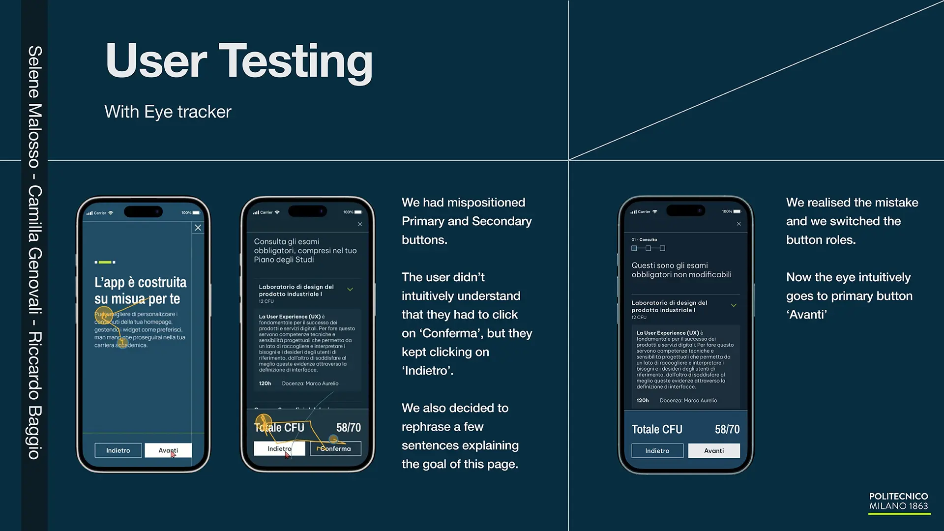
We also conducted a few eye-tracking tests to evaluate how the interface was performing. Fortunately, the information flow and visual hierarchy worked effectively.
In the end, we developed an interactive prototype in Figma, which can be tested below (upon access request).