Nxstride
Logo design
Here’s the research and development process for NXTSTRIDE a purpose-driven sports agency based in London.
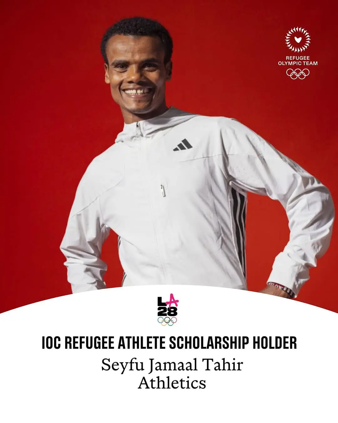
(Here’s one of their athletes who is a refugee called Seyfu)
The concept we worked on was about growth and positive results. We explored various opportunities and concepts based on the client insights:
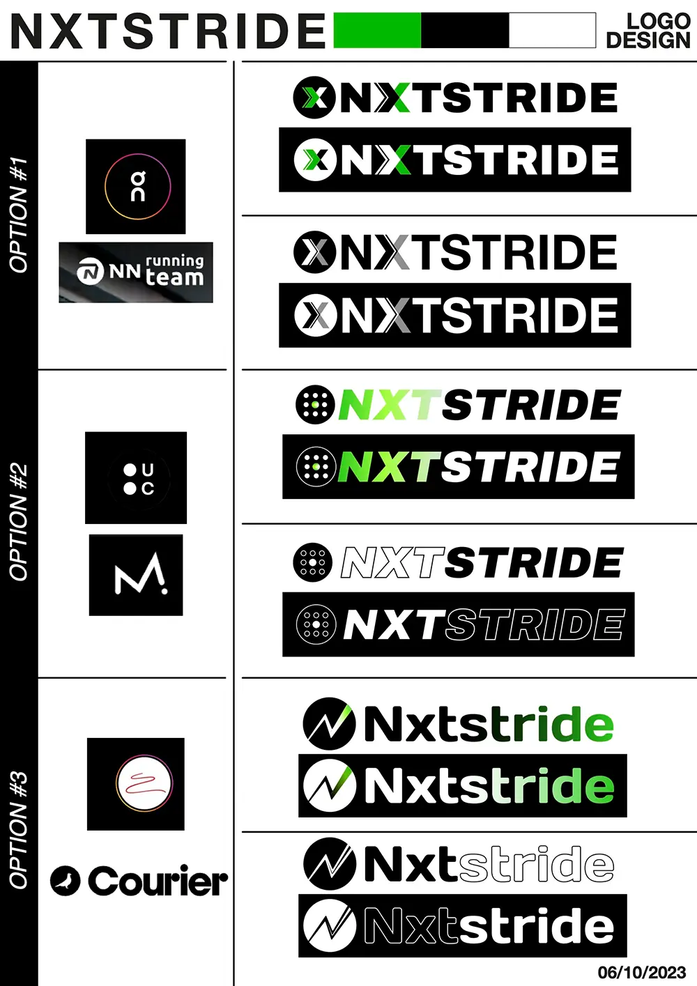
Option #1 and #3 share more or less the same concept of pushing forward (left to right). Option #2, instead, was more focused on “scouting” for the true gems and empowering them. The clients liked option #3 the best, and honestly, I like it too.
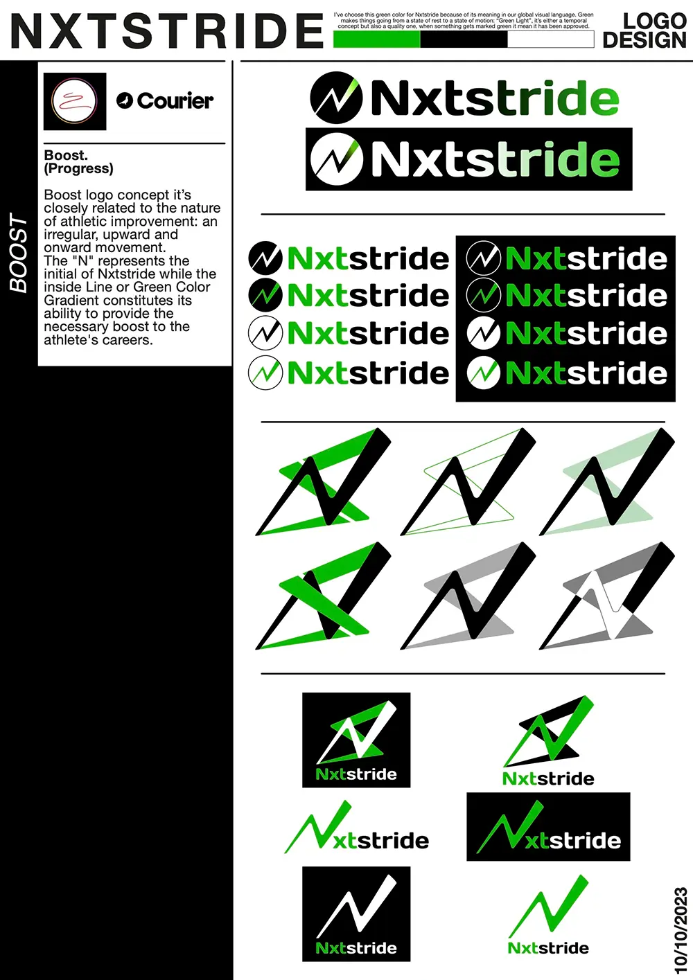
The growth movement is accentuated by the upward motion, and the N-shape clearly represents the nature of every athlete’s growth process. Athletes always aim for the best, but the N-shape occurs naturally; even a bad training session is ultimately aimed at improving performance.
Here are a few different variations I’ve made based on option #3:
I also really liked the logo with the inverted “shadow” behind it, which looked very neat. However, for the client’s purposes, the minimalistic one was clearer and more straightforward.
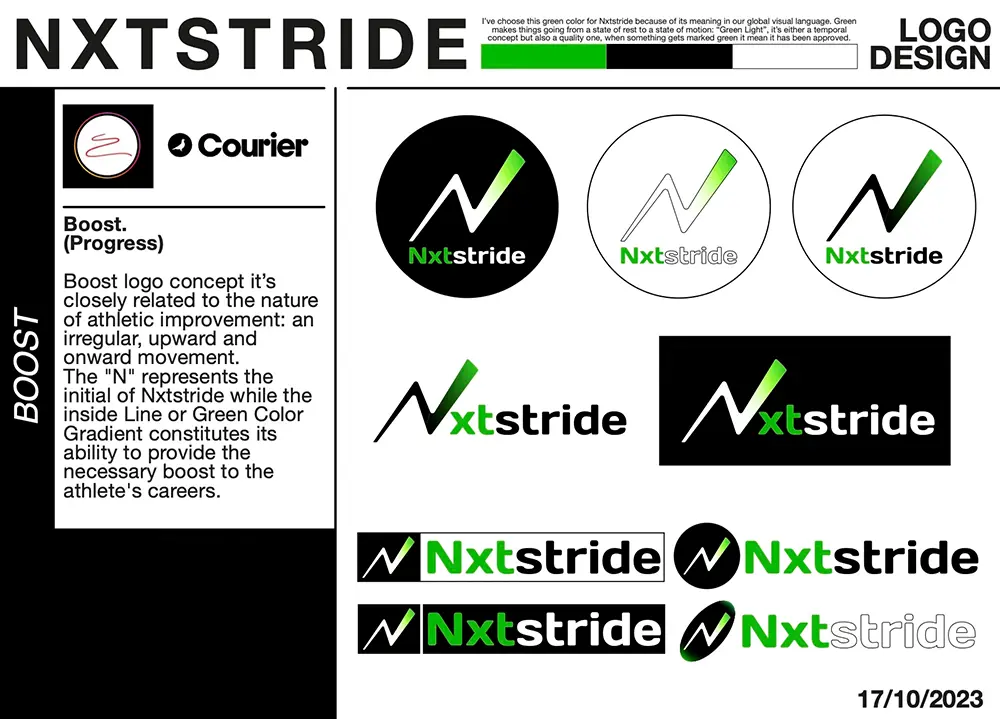
Here is the final iteration of the logo: